
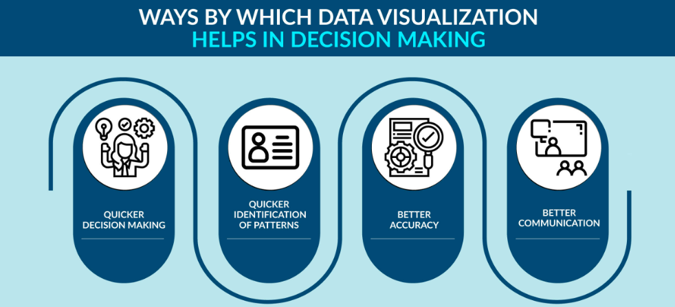
Data Visualization means showing data through charts and graphs instead of long tables. It makes information easy and quick to understand. In Data Science, it helps turn complex data into simple insights for better decisions.
Graphs help people see patterns and trends quickly. Instead of reading huge tables, a simple chart explains the same story in seconds. It saves time, avoids confusion, and helps in correct decisions.
1. Retail Store Sales – A bar chart shows which product sells most.(example) A shop records sales of products A, B, C, and D. A bar chart shows Product A sells the most, so the shopkeeper stocks more of it and improves sales planning.
2. COVID-19 Cases – Governments used line graphs and heatmaps to track rising cases and decide on lockdowns or extra hospitals.
• Bar and Pie Charts – Compare categories.
• Line Graphs – Show trends.
• Heatmaps – Show patterns.
• Dashboards – Combine charts.
• Scatter Plots & Histograms – Show distribution and relationships.
• Business – Sales and profits.
• Healthcare – Patient tracking.
• Education – Check student performance and progress.
• Government – Use survey data for planning and policies.
Data Visualization turns numbers into simple visuals. It makes decision-making faster and smarter. In short, visualization makes data easy to understand and helps in better planning.